

The main goal of user experience (UX) design for an e-commerce website is to make the customer purchasing process enjoyable. UX design involves shaping each component of the e-commerce website so it results in a conversion. This includes all elements including esthetics. In fact, a web site’s esthetics have a significant impact on users’ perceptions of its legitimacy.
UX design structures the presentation of this information to convey both overt and covert messages to users by using information in the form of text and visual elements.
Review Your Website for UX Design Issues
Understanding the current state of user experience is necessary before you can make improvements. Finding the Web site’s trouble spots is the first step in this process. An analysis, or audit, of an e-commerce Web site can be carried out manually or with the aid of tools that do the analysis for you. Understanding the current state of the user experience also requires knowing the status of an organization’s customer-support offerings.
You have to review user behavior on your website as part of this audit. Metrics like bounce rates, time on page, average page views, and conversion rates can help you understand user behavior. Each of these metrics provides a unique perspective on the user experience provided by your website.
This kind of analysis can assist you in identifying the user-experience issues you need to address to boost conversions. You can start working on developing solutions once you’ve determined the site’s shortcomings.
Generate a Theoretical Purchase Journey
Describe the user experience for your e-commerce website in a hypothetical purchase journey that goes from the marketing channel to the purchase order. Make sure to include every step a customer would take to purchase a product when you create such an outline.
By following these steps, you can break down the journey into pages, choose the user-interface components that will work best on each page, and then design each page of the website as necessary. Each page’s user experience should motivate customers to continue their purchase process.
You must simultaneously draw attention to appealing qualities and details about the goods and services you provide. You can use this information to dispel any client objections. For instance, you need to emphasize on your product details page that you are offering international air freight for quick delivery. This might draw clients who need a product right away.
The customer should get closer to making a purchase on your e-commerce website with each step in this process. The issues that a customer might encounter during the journey can be addressed using the insights from your UX audit, which will improve the user experience for the corresponding pages.
Simplify the Navigation

It would be difficult for customers to find the product they were looking for if you displayed all your products at once. Customers can easily navigate from one page to another with a straightforward navigation system. Navigation system may include various product categories based on their type, use, or popularity. Alternatively, menus may direct users to key pages on your e-commerce website. The navigation elements must be positioned to maximize visibility for your most alluring products.
Navigation is enabled by the availability of a search function. To further ease the burden on visitors, think about including search suggestions. Customers should be directed toward their preferred products by these search suggestions.
Use Personalization
Although people value having options, Hick’s Law teaches us that giving people too many options makes it difficult for them to make a decision. For this reason, you should customize the user experience on your e-commerce website.
Users may complete their purchase journeys more quickly with the aid of personalization. You could provide a range of filters based on various features of your goods. For instance, users can typically find products on fashion websites based on gender, style, size, color, and brand.
The user experience can also be tailored by making unique landing pages for various marketing campaigns. For instance, your landing page should only include items from that category if a visitor arrived at your website from a blog about formal attire.
Go for a Minimalist Design
A simple layout makes it easier for the user to concentrate on the key components. The goal of minimalist visual design is to eliminate all unnecessary distractions to successfully direct a user’s purchase journey.
Ask yourself this straightforward query for each element on a page: “Would this element help visitors complete their purchase journey?
If the response is “no,” that component must be eliminated. For elements within elements, the same holds true.
Minimalism can assist you in making important information more appealing to visitors rather than overwhelming them with information. Whitespace and positioning can be used to highlight your products’ key selling points.
Use Visuals for Product Information
Product pages that are overloaded with textual information tend to be less helpful than they could be. Utilize design to make text into visuals to save customers’ time. As an illustration, you could make clever infographics to inform visitors about a product. Or you could use pictures, animated GIFs, or videos to illustrate different product use cases.
The likelihood of conversion increases because people are more likely to consume the information you present in visual form.
Use Clear Calls to Action
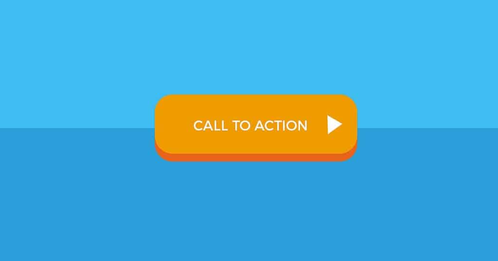
A call-to-action (CTA) button serves as the link between each stage of the purchasing process. It tells customers what to do next.
A CTA should nudge users to choose their preferred product on the home page. On a product page, a CTA should encourage customers to add that product to their cart. CTA buttons direct users in this way toward making purchases.
Any CTA button needs to be prominently displayed on the page and be easy to see. Most importantly, it should have a button-like appearance. When designing a CTA button, use contrasting hues, bold fonts, and distinct outlines.
Be Transparent in Price Calculation
One of the main causes of cart abandonment is unexpected costs and fees. Cart abandonment accounts for 64% of all abandoned purchases. Customers may feel duped if they see different prices on the product page and the checkout page.
Of course, it would be challenging for e-commerce companies to disclose all fees upfront before they are aware of customer information like shipping address, purchase amount, or applicable offers. Consider including a cost calculator on the product page so that customers can input all the necessary information to determine the final cost of the item to solve this issue. Make sure to only request information that is pertinent to determining the cost. At this point, if you ask users to subscribe or submit credit card information, they might not even finish the cost calculation, let alone proceed with the purchase.
Simplify Checkout and Payment
Another significant factor in cart abandonment is an overly complicated checkout or payment process. In fact, 24% of customers give up on a purchase if an ecommerce website requires them to register. Additionally, if the checkout process is too drawn out or difficult, 17% of customers are likely to abandon their cart.
The user experience for this final step in the purchase journey should be as simple and straightforward as possible. Avoid adding any obstacles between checking out and making the final payment. Only options that specifically relate to the product, payment, or shipping should be included.
The checkout page’s UX design should be straightforward and uncomplicated. Customers must understand exactly what is required of them to purchase the product. Giving them specific instructions on how to provide their delivery address, payment method, and shipping choices is part of this.
If you want the customer to take any subsequent action, you should defer providing that option to the order-confirmation page.
Takeaway
Best practices for ecommerce UX design are highlighted in the recommendations in this article. But these recommendations might be interpreted differently by each brand. The creator’s intentions determine how the elements of an ecommerce UX design should be presented.
Your UX design should be based on the steps you want users to take. You must create a UX design that inspires the user to trust you and want your product to create an ecommerce website that is conversion-driven. If each page of your website is designed to create this kind of experience, you can raise the likelihood that users will convert on each page they visit.

